We have released a new book, "Social Media Content Marketing: How to get into the head of subscribers and make them fall in love with your brand."

Welcome to our blog of highly qualified specialists, where you can find a large number of unique articles for every taste! Terrible? Agree. The Internet is full (so far!) of low-quality sites with the same low-quality content. I have written more than once about what “quality content” means and how to create it. But this is all in the form of general advice and recommendations. I want specifics. Therefore, now we will learn from real examples.
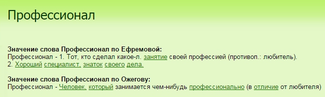
Text for the main page of the site No. 1
The first site ranks second in the Yandex TOP. Not bad. Let's see what we have here on the main page. Separately, I would like to say about the title. I specifically googled the slogan “an easy way to a transformation” and 7 out of 10 positions on the first page of the issue are beauty salons. Original.

- “Yours” and “Visitors”. First, the reader is addressed directly, then they speak in the third person, then again there is an appeal. The text must be in the same style.
- I'm not sure, but perhaps they tried to stuff “red gate metro beauty salon” into this text. But if this is not so, then why such a crooked design? The keys “beauty salon moscow” and “beauty studio moscow” are also clumsily entered.
- “Innovative and the latest technology..” Innovative technologies in an ordinary beauty salon with low prices? Are you seriously? For a hair dryer with a new kind of blower and some “Wrinkle Smoother - 2000” that every salon has, these are too big words.
- “...European service standards and individual approach”. Russian standards for beauty salons, most likely, do not exist. Perhaps something similar was in the Soviet Union, but now it is no longer relevant. Therefore, the European standard is something that should be in every salon simply by default. As for the individual approach ... How can you cut your hair, rejuvenate or paint your nails without it? That is, you want to say that in your salon, before getting a manicure, they ask what color to paint them in? But other studios do not, or what? Do not write obvious things in an article on home page site and pass them off as benefits.
- "You can". Yes I can. What if I can't? Oh, do I have a choice? Well, then I'll think about it.
- You cannot write “full set of procedures” when the following is a list of three items. If you want to “take” in quantity, then paint everything in detail. This also applies to the “extensive range of services”.
Text No. 2

- “Created under the motto “Create!””.
- The best masters, the best stars, the work of high level. In general, the text is oversaturated with all sorts of amplifiers, and unfounded ones. If you write “best”, then either “because ...” or “in the opinion of ...” should follow.
- “Fashionable coloring work…. and complex work for coloring."
- It is better not to write about the fact that young specialists work for you. If you want to convey to the audience that the guys at the salon are fashionable, like to experiment and know not only “under the typewriter” and “square”, then write like that. For many, youth = inexperience.
- The review looks implausible, ordinary people do not write “enough” and “very”, of course, unless you served a copywriter;)
In general, the entire text is written somehow very crookedly. One gets the impression that its author is an employee of the salon, who in the 9th grade received fours for essays and therefore he was entrusted with writing articles for the main page.
Text on the main page of the site: an example № 3
Just look at this design. Here's how to properly design the main page of the site!

Joke, of course.
But seriously, the video on the main page is pretty good. In this way, you can increase the behavioral factor. In addition to the mistake in choosing the site design, I found a few more shortcomings in the text:

- First, an introduction. I call this “creative for 100 rubles”. Not only is the beginning of the text absolutely not attractive, it is also repulsive. Too screwed up, too overexcited. Yes, and this turnover “Now you can stop all searches, because you have already found everything you need.” Yes, who told you?
- Secondly, the confusion with the appeal. Please note that users are addressed to “you” or “you”. Still, I advise you to deal with such things in advance.
- The phrase “professionals operate on the most modern equipment” is more like a description of the work of employees of a factory. It does not fit into the theme of a light and airy beauty salon.
- “The best manufacturers with a worldwide reputation” - be careful with such definitions. Shauma shampoo, for example, also has world name. In general, this is not something that should be placed on the main page of the site.
- The high quality of service, the best masters, the most affordable prices are the attributes of every mediocre company that have not caught the client for a long time.
- The item “And that's not all” is worthy of a separate article. "M" - marketing.
Article on the main page of the site No. 4
Here I did not parse the text to the end, since the text itself is very good. Here are the shortcomings, which nevertheless managed to be found.
Here is an almost perfect home page for a beauty salon website:

- banner with a beautiful girl and a call to action;
- description;
- positioning;
- and nothing more!
Why does it work?
Firstly, no one reads long texts on the main pages. Well, maybe a few people in the face of content maniacs and your competitors. Even if you describe all your benefits in an angelic song for several pages, it will not work. The main secret of writing articles for the main page of the site: everything should be short and clear.
Secondly, the site must be user-friendly. Services - in the “services” section, news in the “news”, etc. You don’t need to sculpt everything on the main page in fear that the user will not look into other sections. Instead of thinking about how to fit everything about your salon on one miserable page, write down the structure of your site.
Third, you don't have to "sell" anything. People go to salons not so much for a service, but for prestige, atmosphere, and mood. So, give people what they want!
Summing up: how to write text on the main page of the site and not look pathetic
I hope that text analysis helped you see your mistakes (or copywriter's mistakes) and henceforth you will create only useful and enjoyable content! Good luck:)
By the way, we have a lot of articles-instructions in which there are a lot of practical tips with a history of many years of practice. To receive all this wealth as quickly and reliably as possible, I advise
Looking around the main page, the average site visitor will trust the impression of the design, interface, style. Decorated "on the knee" will cause a reflex reaction of closing the tab - he did not ask for this! The migration of the consumer to the Internet has made the main page a “virtual front door” for a modern company. What is the selling feature of pages that convincingly represent top brands? How to design the main page of the site correctly and not get a monument of design thought, instead of a tool for achieving your goals?
The opinion of conversion researcher Brian Massey on how the home page of an online resource with a commercial offer should look like:
The best design is not the one with which you emphasize the status and style of the company. The best one is the one that will drive conversions, having motivating elements and great descriptions that encourage you to click the CTA button
The approach of a confident market leader: Reebok microsite homepage
Rules for the design of the main page of the selling site
- A bright title is reinforced with a subtitle that is relevant to the image
- Powerful call with subtle animation to highlight the intended intent
- A positive image, drawing attention to the brand's offerings, stimulates consumer desire to have what they like.
- The hero header establishes the idea of product usefulness in the minds of visitors, showing how others use it.
Main rules of the home page
1. First, the benefits of the offer. For the recognition of the Pepsi-Cola trademark site, one name is enough. What about yours? In the famous book "Don't Make Me Think!" Steve Krug muses: “Will you stay on the site without understanding its purpose?” And yet, in the modern commercial sector, apparently not wanting to lag behind the mentioned superbrand, everyone strives first of all to improve the consumer opinion about the product / company:
- Describing the activity itself briefly, the benefits of the proposal are exhaustive - at least about features, more about utility
- Emphasizing on the winning sides of your approach…with reviews, etc.
Filling out form fields, the CTA itself is stressful. Interest in the offer helps to overcome it, and not the "Subscribe", "Buy" buttons. Soften one-word categoricalness by offering something: Learn the recipes, Request a demo. Brief information does not overload the task and will not make you feel lost. More importantly, instead of a "WEB Brochure", the site becomes a sales and lead generation machine.
3. Social proof. Public utility is the measure by which it is customary to “evaluate” a trade offer.

An incredulous visitor screwed with negative reviews on the Internet is unlikely to interpret doubts in your favor. Silence will only confirm his fears of insecurity with insecurity. On the front page of your site, you need to get ahead of consumer fears. Beat them by convincing them otherwise.
The power of social confirmation psychologically affects the crowd, which trusts the "collective experience" and is ready to forget even about the rationality of their choice.
Partnerships and mentions on the sites of popular publications are usually shown as social proof. According to the canons of the main pages, they are designed succinctly:
Option with running numbers animation, statistics: projects, % of satisfied customers, retention rate…

4. An effective headline is a "bait". Alluring and tenacious, it catches the user's attention, prompting them to stop and learn a little more.
Good heading - like a pioneer:
- Always ready! - focused on consumer convenience
- An example for all children! – adequate / “expert” / appeals to authoritative opinion, like “Matt McGee’s methods for optimizing your site’s home page”
A bad headline is like a sausage:
- Need to boil
- Don't expect quick conversions - the semi-finished product needs to be finalized for validity
Is it worth it to load it with tasks from which accuracy is lost? You can detail a unique offer with a subtitle used in pairs and enhancing the effect ... . Usability study from KISSmetrics:
The ideal title is 6 words (3+3): in search results a quick glance covers three words (from the beginning or from the end). MOZ calls the optimal Title in 57-59 characters
Signs of an effective headline:
- Syntactically not overloaded, succinctly formulated - neither subtract nor add!
- expresses competitive advantages(benefit to the user), and not "exemplary" and practical qualities
- Looks like a concrete plan - a proposal with real terms
- Psychologically inspires confidence – is already a selling trigger
- Directly or indirectly reminds of the available time limit / number
- Well crafted: reformulated, catchy adjectives, action-packed verbs
- Provocative, stirs up interest and "without conventions" - familiar in a new sense, with unexpected opposition, etc.
6. Emotional design. The visual mood is created by the emotional message embedded in the page elements, replacing the explanations. A stylized interface can convey the atmosphere of the institution, the power of the image, etc.
According to 3M Corporation research:
83% of human decisions are based on visual information. A visual image is something that is more likely to be remembered and trusted. Visual is perceived faster than text by 60 thousand times!
- To optimize user experience
- To communicate in the same language with the right audience
When animating an element, point to the type / location of the content, interactively create feedback(visualization of the completion of the action will explain what happened), etc.
- Location on the page
- User experience (UX)
- Rest of SEO Strategy / Social Marketing
- Level of competition / time factor / utility itself
The close logical connection of the main title with page content and the inclusion of words in the text will benefit the page when. Thematic and minor key phrases can be a godsend, because the completeness of the collection of semantics improves the quality of the presentation of the material. Structuring information, from the main page to the conversion pages, is an effective method for optimizing them…
The increasing influence of the “utility” factor is quite expected:
Optimization that is not initially focused on retention is of little use when user engagement is weak
Pay attention to the type of traffic: branded / niche queries / long tail, so as not to miss important customers.
8. Make the homepage easy to use. Usability is part of UX, and if you sacrifice your individuality (something else), the interests of a visitor who has a different experience, he will answer:
- Greater selectivity
- Failures, preferring to master recognizable schemes (threatens you with loss of positions)
Design the main page with attention fixation points (graphically and textually breaking content into blocks, highlighting with typography, etc.)

10. Attractive idea vs Elaboration of elements. Web audiences will appreciate appeal that is clearly relevant—when the quality of the elements is impeccable and their need is clear.
Lyrical digression. An ancient sculptor to the question of how he creates a sculpture:
I take a stone block, the image of the divine form is already in it. I just cut off the excess
Now there are more opportunities for creative ideas, but they are raw material. The mistake of the master will still ruin the project. Completing the analogy:

Flexible solutions from sculptor José López: "opening the granite page"
Once again about the important:
- Good design is invisible and key elements are where they are expected to be.
- The wider the target audience, the more compromise in design - a MORE good design is required
Read also: UX designs for online stores: the good and the bad. 21 examples
Home Pages™ prod. brands
Among the individually designed and professionally designed branded websites, only interesting designs. But, trademarks do not become brands without effective marketing. With what design marketing solutions today achieve consumer loyalty, look at the examples of the main pages of these sites.
Eco Bread
Worthy design - Eco-Khleb™ website with an online store:

on ch. page
- High-quality rendering of elements and photography of products
- Unique corporate retro style with a beautiful logo
A person
The main page is designed as a promo page - a trademark site on Bitrix:

on ch. page
- A catchy logo for a food manufacturer. The slogan was developed under the “locomotive product”
- Elements selected / drawn / adjusted for image purposes
- When scrolling, the animated menu collapses into an icon; ketchup type changes in sections (special effect)
Read also: 40+ Best Food and Cooking Website Designs
Little Potato
An interesting design option is a promo website for a fast food brand:

on ch. page
- Positive branding with concept dish logo
- HotSpot tooltips engage the visitor with informative descriptions
- Audio Marketing - Listen to the company anthem
Burger King
Fast food chain website with decorative font:

on ch. page
- In a cartoonish interface, a massive font harmonizes with stylized UI elements without overwhelming image photos.
- Social proof is displayed in flip blocks dynamic loading tweets
- Corporate app gets attention with discounts and grunge style
Impressive visual impact
Helps to set a holistic image of USP. The main image image is usually given to feel the seriousness of the sales proposal. A positive picture that demonstrates friendliness, team spirit, applicability… increases the effectiveness of the offer. As an example, a couple of homepages express the brand's aesthetic with exciting and eye-catching backgrounds.
Apidura
The main page of the selling site is an English brand of bicycle goods:

on ch. page
- Impressive backgrounds with gradient transition to separating icons. Stylish translucent menu, contour buttons and
- A phenomenal way to promote a brand with design: the site has already received 10,000 pins on Pinterest boards!
Bright meaning of flat designs
Read also: Flat websites: 20 custom designs
The two-dimensional style has already settled in the minds of users and marketers with designers are interested in new concepts for the main page of web resources. Some are looking for a bright path to high conversions through content-focused design. Having refreshed the image, they are trying to reach a new consumer audience. Others, ease of perception motivates to create visually attractive images for Web projects.
More and more flat interfaces express the style and features of brand positioning on the Internet / offline. See for yourself how "simplification" of brand identity reduces the distance between business and customer.
Moosend
An example of a homepage redesign is a positive site with beautiful typography:

on ch. page
- A single typeface with one font for headings & UI, increasing the recognition of the site makes it easier to perceive its pages
- The design has been improved: the meaning of the brand is embedded in the logo, the registration fields are placed on the first screen, new animations
Tribute Media
American web marketing agency - concise minimum (CMS Drupal):

on ch. page
- Arrows and animated icons indicate slide-out menu/duplicate tab navigation
- The call is placed in the first screen according to the F-view scheme: logo> numbers> button
bizable
The main page with great ideas is the site of a small company:

on ch. page
- A beautiful site immediately attracts with a rhyming bunch of “title + subtitle”
- Soft expressiveness of the UI with tonal elaboration and blurring of the background texture. Social proof and testimonials built into the backgrounds with a carousel
- Forms with field names in the context of explanatory sentences - good usability with a unique design
Zendesk
Home page redesign – website of a modern company with spectacular content:

on ch. page
- With new animations, graphics and video animation, the site has become more cheerful, has become more concise (the drop-down menu hid the secondary one)
- Expressively translated by Zendesk, the polemical tone and direct appeal in the titles is reminiscent of a dialogue
Read also: Animation by UX Design Rules: The Complete Guide
Spectacular pages with interesting design solutions
Today you will not be surprised by the wow-effect on the Main. Useful animation is in trend. phive.pt is a Portuguese fitness website with interactive design in JS and jQuery.

“Dancing”, “exhausted” effectively solves the UX problem: preloading the page already encourages activity
Ged Group
An example of a consistent visual style is a site with jQuery effects:

on ch. page
- Vector graphics harmonize the main page with the inner pages. More than aesthetics! – the user is more confident on a site with a well-defined identity
- 2-6x shape story scene rendered with animated preload
- Unobtrusive front-end micro-interactions, Ken Burns effect for images and scroll animations
Medpraktika
Client-oriented design of the main page of the medical site:

on ch. page
- Laconic design with rendering of the main page with a minimum of colors
- The organization's proposals are originally illustrated: with a block of services and an entertaining hotspot functionality, it keeps the attention of customers
Home page as a landing page
Read also: 30+ Responsive HTML Landing Page Templates (Free, Premium)
When SEO bonuses (search traffic) are combined with the features of landing pages, a selling visual creates an emotional effect of engaging in the right atmosphere. With increasing user attention, the home page of the site becomes capable of generating a ready-made client from organized marketing campaigns.
When I just started my way in copywriting, I often faced the problem of finding the information necessary for work. For example, which of the newcomers has not tried to find certain patterns for writing certain articles (reviews, reviews, releases, etc.)? So that you can just substitute a few of your sentences and get a great text.
Personally, I have encountered such a problem and I can confidently tell all beginners that there are no such templates (believe me, I searched the entire Internet in my time). Having gone through the stages of writing simple informational articles, I wanted to move forward and learn the techniques of writing more complex texts.
When I was ordered the first text for the main page of the site, I took it up with the confidence that I could easily cope with the task. This is where I made the mistake that many beginners make. I think you guessed what it was. I just rewrote the main page of a site with a similar theme.
It was only later that I realized that this act was unforgivable. The article was accepted and paid for. Of course, I was satisfied with my fee (even though it was very small).
They paid 100 rubles for my work, if I'm not mistaken. Given that I then worked at a price of 20 rubles per 1000 characters (now it seems ridiculous J, but many start with this figure and even less), for me it seemed like a big payoff for the work.
What should be the text on the main page of the site?
All the rules that I give in this article are taken from personal experience. Therefore, take and apply.
First of all, I would like to say about the size of the text.
Many bloggers may argue with me here, but I will note that the text for the main page should be up to 2500 characters in size.
There are customers who ask to write a text of 5000 characters or more. I usually refuse such orders or try to convince the customer that this will have a deplorable effect on attracting potential customers to his company. Moreover, huge "word sheets" on the main pages scare away customers.
The text should be specific. To give more detailed information about the company, a separate page is created on the sites. And the main page of the site should be of an advertising nature. From the text, the visitor must understand what exactly he can get.
To make it clearer, let's go in order.
Title and intro

An advertising slogan may be used instead of a title. This is a mandatory requirement for every text, but many webmasters neglect this rule, but in vain. After all, as you know, we have only 10-15 seconds to lure the reader to further reading. Therefore, both the title (or slogan) and the introduction in the text should act as a kind of "hook". If we hook the reader in the first steps of reading the text, then it will not be difficult for us to successfully bring it to the end and make a certain decision.
What's next?
After the title and catchy introduction, you need to introduce the company.
This is where you need to be careful. No need to shout loudly about "How Good We Are" and "How We Work Awesome". This approach is called "goodbye customers."
Also, do not use all the boring banal phrases:
- "For every taste and color"
- "The widest range"
- "A rapidly growing company"
(The list can go on and on)…
Get all the necessary information from the customer and make the text in such a way that it expressively differs from competitors' sites in the same subject.
At the first stages, it may seem difficult, but, believe me, after writing 3-4 texts for the main pages, you will no longer experience difficulties, but on the contrary, you will begin to enjoy this work immensely.
Customers appreciate good copywriters, as it is quite difficult to find them. And many are always ready to pay good money for an excellent author's text on the main page of their site.
Returning to the topic.
Describe specific facts and figures, the company's proven accomplishments and advantages over its competitors (no names).
After that, competently tell the reader what benefits he will receive by contacting this company. Be very simple here. Do not use unnecessary terms that may be incomprehensible to an ordinary person. Otherwise, the potential client will leave the site.
Well, at the end of the text, explain to the reader what he needs to do in order to become a client of the company. This can be a link that goes to the contact page, or a phone number (this is specified by the customer - the owner of the site). The main thing is to encourage the reader to take a certain action and become a client of the company.
E more tips for writing text for the home page of the site
Try to divide the text into subsections and use subheadings. This text is easier to read.
Never copy content from other sites. This will prevent the indexing of the entire site, and when rewriting, you will not develop your individual style, which is so valued in the copywriting market.
Now you know the basic rules that must be followed when writing text on the main page of the site.
I think this post can be ended.
Ask questions in the comments. I will answer with pleasure.
If you liked this article and find it useful, tell your friends about it using the buttons social networks. I will be very grateful to you.
Yuri Galmakov.
Leave your questions, wishes and recommendations in the comments. We always try to create only the best materials for you.
The theater starts with a hanger, and the site starts with the main page and the text on it. Many site owners know about this, try to follow the recommendations of search engines and fill their resource with useful information.
But here it seems that what to write about on the main page of the site is a mystery behind seven seals. How else to explain the presence of all sorts of “Welcome, you have come to the company’s website”, “We are glad to welcome you to the website of the online store” and canvases of texts along with them? And no, we do not invent, the amount of such content is still off scale, although it is high time to get rid of it and write for people. However, it is worth looking into the output, and voila:
Be honest with yourself, did you get something useful from this text? And in general, would they read it, did it visually attract you? That's it.
Or here is another shorter version, but also not carrying any benefit:
They greeted us on the site, wished us a pleasant shopping, but did not tell us anything useful.
Or another main one with text:
Replace the word "kitchen" with any other, and a "welcome" text is ready for any topic - from apartment renovation to a custom-made sofa. But whether it will help to keep the visitor on the site and lead him to a purchase is a question.
Once again about the important: why write the text on the main page?
A good text on the main page is, first of all, competent and attentive salesman. Who else will talk about your product or service and literally lead you to a purchase by the hand?
But this is the Internet, not an offline point of sale, there is no need for extra greetings, do not waste the user’s precious time on useless scraping, worn out clichés and watery footcloths of texts.
Just a couple of seconds will be enough for the client to understand whether the page is interesting to him or not. One bright design, a beautiful logo and a simple listing of products is not enough. “Welcome” or “Glad to see you” won’t help attract a person either. You need to interest the visitor so that he does not close the site and goes to competitors. And the importance of the text factor for ranking has not been canceled.
Without high-quality, interesting texts, there can be no talk of either optimization or benefits for visitors. I want to believe that everyone accepted and learned this fact.
What to write on the main page of the site?
You need to give the user the most important information about goods, services, advantages of working with your company. That is, in fact, it should be a brief retelling of the site itself: what do you offer, under what conditions, at what price, what chips do you have and why is it profitable for the user to buy or order something from you.
At the same time, it is important not to pour water and not breed huge boring footcloths of text. It will be enough to write a text of about 2000 characters on the main page of the site.
Recall that 2000 characters is an average value, do not get hung up on it. You can write more or less - it all depends on the business, the topic in general, competitors in the TOP, target audience and her needs. Necessarily you need to take into account your specifics, the interests of potential customers and carefully analyze competitors. And only after that determine the volume.
But in any case, you need to write strictly on the merits. Do not pour water, your users do not need it and will not bring you any effect, it will not add customers, it will not bring it to the TOP. On the contrary, for the lack of sense, you will receive a ticket to Baden-Baden.
In the general vision of the picture, we hope we figured it out - thesis, but at the same time we tell interesting potential client about the most important. Let's move on to the details.
How to write text on the main page?
Imagine you are interested in building a house and you are looking for a contractor. Design aside, which of the texts is more understandable and credible:
Is the first one a stream of consciousness without any specifics, or is the second a well-structured, well-thought-out text with facts and a breakdown into semantic blocks? The conclusion suggests itself.
An intuitively composed text about everything and immediately will not be a good “salesman”. In fact, you pour a tub of cold water on a person, while not explaining anything and leaving him alone with information. What he will do with her and what he should do with her - this is already left behind the scenes. You can't do that. =)
You need to clearly understand what information the target audience needs, what answers the client wants to receive, and what goal you want to achieve. And proceeding from this, build the text according to a certain logical scheme. This approach will help lead the client through all the complexities of choice right to the purchase, order or call to your company.
At the same time, there is no need to reinvent the wheel, there are proven schemes for selling texts:
- AIDA (Attention - Interest - Desire - Call to Action)
- ACCA (Attention - Understanding, perception of arguments - Persuasion - Call to action)
- PAS (Problem - Attention - Solution)
- ODS (Offer - Restrictions - Call to Action), etc.
In general, it is not so important what the technique is called, you should catch the essence: when writing text on the main page of the site, all the information is logically and correctly laid out on the shelves. You need to identify the problem, draw the attention of the client to it, and then offer your solution, convince the person of its effectiveness, give weighty arguments and push for action. Plus, do not forget to spice up everything with specifics, facts and buns that are valuable specifically for the client.
What blocks and information to use?
Let's go back to the example above. So, you live in the Moscow region and want to get your own house.
What interests you more: the reasons why people tend to move out of town or directly to a beautiful and eco-friendly cottage with a 10-year guarantee?

You are already looking for a company that will build housing. Agree, the text from Captain Evidence about one of the most popular types of cottages, the efforts of builders to create comfortable living conditions and no one will read a couple of paragraphs of such information. For informational article such information may also be suitable, provided that all clichés and templates are replaced with something really important, but for the “facade” of the site - definitely not.
And it’s a completely different matter if you immediately see exactly where the company works, what guarantee it gives for the house, what kind of timber the cottage is building from, why such material is cooler than analogues on the market, and when builders can start work at all.
Unfortunately, in the minds of many people, text is only a canvas of information and nothing else. And the site presented in the second example will cause a lot of indignation - that, they say, this is some kind of nonsense, cutting sentences, nice design and that's it. So, this is the text =) And just the one that will work - thoughtful, structured, with clear and useful information for the client.
It is separate semantic blocks that will help to put everything on the shelves in the mind of the client. It is necessary to issue information in dosed, in small volumes and in a form convenient for perception.
But there is no single scheme for absolutely all subjects and all target audiences. So an online plumbing store can almost immediately show the product in person, and a site selling some kind of innovative portable grill oven can first explain in detail what this beast is for, how it differs from a regular grill and what is its value.
You need to write text on the main page only based on the specifics and goals of your business, as well as the needs and behavior of the audience. Otherwise, a walk-through template will show off on the main one, which will not bring any benefit.
Maximum full list blocks when writing text on the main page looks like this:
- headings;
- tagline in the header;
- USP and text in the first screen;
- description of goods \ services;
- prices and their justification;
- benefits with a focus on customer benefits;
- guarantees;
- certificates\documents;
- visual and detailed cases;
- scheme of work;
- promotions\discounts\special offers;
- information about company employees;
- reviews;
- additional important and useful information;
- sliders;
- call to action.
In this case, in no case do you need to use absolutely everything from this list. You should choose wisely and use the 5-6 most relevant blocks. The desire to tell everything at once and more is understandable, but you should not overload the page with information, you need to focus on the main thing.
Masthevy or what not to forget to write on the main page of the site
Catchy headlines
This is the first thing a person sees on the page and 70-80% of success depends on this information. If the user's title is not hooked, then he will not read further. Therefore, it is important to clearly understand what you can give to the target audience and voice the most tempting offer to them. Also, don't forget to use keywords, the era of space search may have come, but it’s still too early to refuse competent optimization anyway.
There is no title at all. There is nothing for the eye to catch on in the text, it is not clear where you got to and what you can find on the site.
A couple of seconds are enough here to get the most important thing - we are on the site of a cattery where you can easily buy a pet. Everything is accessible and transparent, there is no need to search for details on the page.
Information about a product or service
No need to force customers to play a guessing game and think about what can be found on the site. Basic information must be provided concisely. At the same time, do not use complex sentences, incomprehensible terms and lengthy descriptions. There should also be no confusion and water. For the product, specify the parameters, characteristics, dimensions, important properties. For services - a specific scope of work, a step-by-step description, terms of provision, pitfalls, etc.
Here's a great example of what not to do:
No information about the products, only the "More" and "Buy" buttons. Indeed, why? The visitors are all psychics, either guess or click on the buttons, and then they will figure it out.
Here we see the opposite picture: it is indicated what the corrector is made of, what it gives the user. It is told how the corrector works and in what case it will help.
And this is not a huge boring description - everything is short and clear. The client immediately gets an idea about the product, there is no need to look for or think of anything additional.
Prices
Never hide prices, this will only scare away users. Popular objections of business owners in this regard:
A) “I don’t want my competitors to see my prices, so I will never indicate them”;
B) “I don’t have a fixed cost, everything is calculated individually.”
All this, of course, is wonderful. Only now, competitors will spend their time dialing the operator, requesting a price list. And it will be easier for the client to go to another site where information is not hidden, especially since there are a lot of offers in any area.
Imagine you came to Eldorado for a teapot, and instead of price tags on all goods there is a sign “ask the price from the seller”. Do you need it? It is more logical and easier to go to M-Video, see prices and buy.
The absence of a fixed cost is also not a problem - you can always tell how it is formed and what affects it, indicate the price range, place a calculator, etc. It is important to give a person at least a rough guide, and for an accurate calculation, offer to fill out an application or make a call.
A few implementation examples for inspiration:

Benefits with a focus on customer benefits
Tell why the client should choose your store or company, why you are better than your competitors. Good service, extended warranty, fast delivery, free goodies and options, convenient conditions - hook the consumer with something really useful that will make his life easier and better. At the same time, think from the client, not from yourself. In the foreground there should be a benefit for the target audience, and only then you.
No “we only have highly qualified professionals” and “we are developing dynamically, and therefore you will receive only the best.” Do not promote yourself and do not put the already boring clichés into advantages:
Solid "we-we-we" and one water. What terms, how to check the quality - a mystery shrouded in darkness.
Talk about things in the world of the client: “we will deliver to the door within 1 day - you don’t have to wait for the goods for weeks”, “we will give you a 50-year guarantee, because confident in the quality of our product. Sell not yourself, but the benefits. How to do this, we wrote in detail in this article.
Call to action
Directly write what the visitor should do after reading the text: call, write, press a button, go to the directory, etc. Target action, also known as CTA, is actually an element of hypnosis. It stimulates, gives the user a clear instruction on what and how to do to receive a product or service.
We often come across a situation where a client asks to remove the CTA and all other “obvious elements” - they say that his visitors will already guess what’s what, don’t make idiots out of people. So, they won’t guess: imagine you came to the site, scrolled through 5 screens of text and suddenly it ended abruptly. No phone, no link, no form, no button. Where to apply? To return to the cap is again something to flip and scroll. And if there are no company contacts there, it’s generally a disaster, no one will search on other pages. Therefore, the following picture is obtained: it seems that they wrote a text on the main page of the site, and a good one at that, the person became interested in it, but they simply did not indicate how to contact you. As a result, the client was lost.
Here are a few good examples CTA design:

Delivery, payment, scheme of work
In a nutshell, indicate the delivery time, indicate how to pay for services or goods.
If you have a complex multi-stage scheme of work, be sure to explain each step of it, guide the client through all the stages by the hand.
This will remove unnecessary questions and increase trust - everything is clear, transparent, which means no pitfalls and deception.
Delivery times, payment details, details of cooperation are important for every buyer and customer, regardless of which segment you work in - b2c or b2b. Therefore, there is no need to hide them, briefly mention all the main points on the main page, and place detailed information in separate sections.
What you can immediately and irrevocably refuse on the main
Remember, the text should please and be useful to your target audience. Empty highly literary descriptions, information about the company's mission in this world, empty slogans, the history of the company's creation - all this may be beautiful and expensive for you, but the buyer does not need it.


Such information will only distract the user from the most important thing - the order. The customer does not care whether you have combined classical traditions with a passion for innovation or not, whether you are positive or not, whether you want to develop dynamically or not. These are empty words, and they do not characterize your goods/services in any way. Therefore, feel free to remove such information from the main one, it does not belong there.
Instead of conclusions
As a matter of fact, we told how to write text on the main page and what main blocks to use in it. You can supplement the page with reviews, cases, certificates, information about specialists - but this is all strictly individual. Indicate the main thing, do not get carried away with too voluminous texts. Remember, they have no place on the main page. Everything should be logical, concise and justified.
It is not so difficult to decide what to write on the main page, it is much more difficult to create a really effective and useful material. If you need help, please contact. If you want to prepare the text yourself, work with USP, make the maximum emphasis on the semantic component of the text, but do not forget about optimization.